Prep:Go to Amazon and Google and get your affiliate codes.
AdSense:
Make sure you use a channel to track every site.
Also, use a basic color scheme. Make sure the links are blue, as this is what most people are most familiar with.
You will need 2 styles of ads:
300x250 - Ad Block - add to top.html
728x15 - Text links add to footer.html
Note that they are different sizes AND different ad formats.
Go to Amazon and get the following banners for the category that closest matches your keywords:
728x90 banner - Add to header.html
120x600 banner - Add it to navigation.html
Note that these four html files are called using SSI tags in the templates:
footer.html
header.html
navigation.html
top.html
This means that if you change anything in one of these files, it will affect every page on the site.
Remember, the Adsense, Amazon and picture code is all in the .html files that are called using SSI. This means you won't see them until you upload them to your site, then check them out in your browser.
Don't slack off with this...Amazon is important for 2 major reasons:
1. It is against Google's TOS to build sites just for AdSense. Putting another revenue stream adds a bit of protection from Google's TOS.
2. The banners help control where your visitors look...Tests have shown that people have trained themselves to look away from banners. Because of this, we are using Amazon's banner to manipulate where people will focus on the page. We want our Adsense ads to be the "center of attention".
The next step is to add a graphic related to your keywords.
Go to Moreguefile.com and find an image. Morguefile has the most liberal usage license of anyone, so ALWAYS use them in your projects.
Find one that's pretty close to being square in shape.
Resize it so that it scales to 340 pixels wide.
Rename the graphic using keywords, optimize the alt tags, and change the appropriate html code in the top.html file.
This graphic is important for a couple of reasons:
1. A good looking graphic makes pages look a little better and less like spam. Most spammers won't mess with adding a pretty picture.
2. The size, shape and position of this picture teams with the Amazon graphic to really force people to focus their attention of the block of Adsense ads. And in turn, these two work in force with the "heat map" data that shows the natural eye movement of Western readers when we read (scan) a web site.
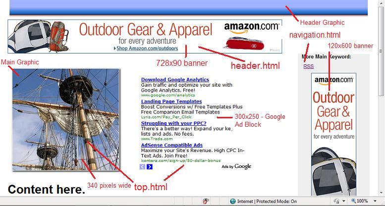
Below is a screen shot of how a page will look in general:

Notice the html files in the graphic above:
header.html
navigation.html
top.html
...Again, these are being placed into the pages using SSI tags.
I've added a few "header" graphics as well as some images so you can quickly change the general appearance of the sites.
Use the general graphics and layout I gave you for the first 2-3 sites. Be quick and productive. After you get a few sites done and master this system, then you can spend a little time finding better graphics. Until then, get sites up and link to those sites.
The header graphics all named header-something.jpg. I put these at the very top and bottom of each template (form #16 in Commentz) and the index.html file.
The easiest way to change this image is to choose another header image and save it to the same folder as your site, naming it:
header.jpg
...And over-write the existing image by the same name.
There's also a bunch of 340 pixel wide pictures to use as the "main" graphic. You can mix and match the header and "main" graphics to get a lot of different looks.
Or, you can use your own graphics...Make them:
Header: about 960-980 pixels wide - 75-125 pixels tall.
Main: No more than 340 pixels wide.
Do NOT spend a lot of time on header and main graphics! You're not after awards. If you must change the graphics:
Make a quick 975 pixel wide banner online here:
http://cooltext.com/
Another option is to use a pre-made header graphic. There are some on the Bombsquad for download. Open them up in a graphics editor and resize to about 960 pixels wide, then make any modifications. But you really shouldn't spend much time on this, unless you have a VERY good reason.
For the "main" graphic, go to www.morguefile.com and to get your images. This is IMPORTANT!!! Morguefile has the most liberal usage license there is...There's no reason not to be safe and legal.
Once you've selected an image, you need to crop and/or resize it so that it is 340 pixels wide or less. It's OK for it to be smaller, you may want to test this once you get traffic.
I suggest you optimize this image a bit whether you use one of the ones supplied or your own:
Rename the picture: mainkeyword.jpg
Add a 1-2-3 secondary keywords to the alt and title tags in the image tag:
<IMG SRC="MainKeyword.jpg" ALIGN="Left" title="another keyword" alt="yet another keyword or two">
This main image can be edited in the top.html file.
Go ahead and download the package (Coming soon) and get used to how the templates and SSI structure work. If you spend just a little time learning this system, you'll be able to churn out highly optimized Adsense sites, complete with RSS and ping in a fraction of the time it would take any other way.
And since these sites are STATIC html, they are perfect to flip. These static sites are a snap to move to another host, unlike blogs which can be a real pain.
I'll post a bot to help automate Commentz to set up Adsense specific sites ASAP.
-Boom boom boom boom.

